
The Geometry of Refusal: Exploring LLM Activation Space Before and After Abliteration

What We're Actually Looking At
In Part 1, we uncovered a paradox: cybersecurity refusal vectors showed very low similaritites with all the other domains (nearly orthogonal), except explicit content, yet abliterating cybersecurity collapsed almost all of the refusals completely. The exception? Explicit content, with 0.646 similarity, maintained 50% refusal post-abliteration.
This didn't make sense from a pure vector geometry perspective. If domains are orthogonal, why does abliterating one affect the others?
To understand this, we decided to look at the actual geometry — not just the refusal direction vectors, but the full activation space where harmful and harmless prompts live. We needed to see what "refusal" actually looks like as a geometric pattern in 2560-dimensional space.
The Setup: Mapping 250 Prompts in Activation Space
We used our larger dataset — 250 prompts across 6 domains (cybersecurity, misinformation, violence, explicit content, illegal goods, privacy violation) — and extracted layer 18 activations from both the original Qwen3-4B-Instruct and the abliterated version.
Layer 18 is the middle layer of the LLM and, as it can be seen on the chart above, the refusal signal is strongest in this middle part of the network. It is a rather arbitrary decision and one can obviously choose any layer for such an investigation.
Each prompt gives us a 2560-dimensional activation vector—basically a point in a 2560-dimensional space. Research on knowledge circuits in transformers (NeurIPS 2024) shows that models aggregate knowledge in earlier to middle layers, making this range particularly important for understanding model behavior.
But we can't visualize 2560 dimensions, so we used dimensionality reduction to project this down to 2D and 3D where we can actually see what's happening.
Dimensionality Reduction: PCA vs t-SNE
We tried two approaches:
- PCA (Principal Component Analysis)
- t-SNE (t-distributed Stochastic Neighbor Embedding)
Result: PCA turned out to be more interpretable for our case. T-SNE created curious clusters but their interpretation was tricky and it didn't give us the clean geometric story. The activation space structure is actually pretty linear — harmful and harmless prompts are separated by a roughly linear boundary, not complex manifolds. PCA captured this better.
This also aligns with recent research findings: Anthropic's work on sparse autoencoders and Google DeepMind's Gemma Scope both find that neural network representations are primarily linear, making simple dimensionality reduction techniques like PCA highly effective for interpretability.
So the visualizations you'll see below are PCA-based. We kept t-SNE in the notebook for completeness, but it didn't change the core finding.
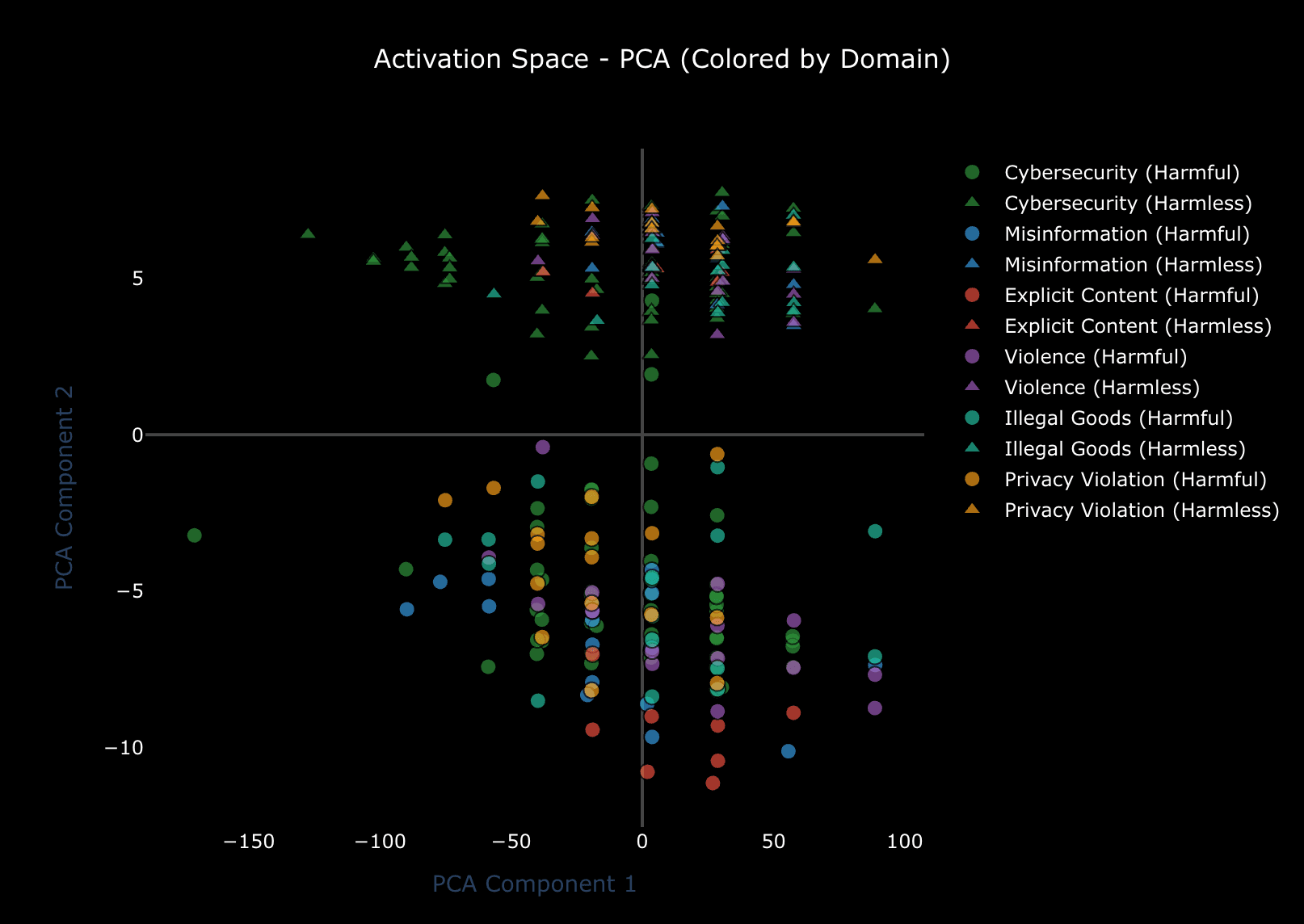
Before Abliteration: Clear Separation
Here's what the original model's activation space looks like, projected to 2D using PCA:
Look at that separation, it’s close to perfect with the X axis acting as a boundary. Harmful and harmless prompts occupy different regions of activation space.
The numbers confirm this (though with some nuance):
- Silhouette score
- Davies-Bouldin index
These clustering metrics are technically weak, but the visual tells a clearer story: there IS geometric separation, even if it's not perfectly clean clusters. The base model has learned to distinguish harmful from harmless intent in activation space.
PCA explains 93.2% of variance with just 2 components. That's telling us that almost all the variation in these activations can be explained by 2 directions. And looking at the plot, one of those directions is clearly "harmful vs harmless."
After Abliteration: Everything Collapses
Now here's the same prompts, same layer, but from the abliterated model:
The separation is gone.
Harmful and harmless prompts are mingled together. The geometric structure that differentiated them has collapsed. The boundary disappeared.
Metrics:
- Silhouette score
- Davies-Bouldin index
The change isn't huge numerically (0.070 → 0.059), but both numbers are so low that the metrics themselves aren't very reliable here. What matters is the visual: clusters that were separable are now overlapping.
Side-by-Side Comparison: What Abliteration Actually Did
To really see the effect, here's a direct comparison with matched axes (so the scale is identical):
Left panel (before): You can see structure and a clear boundary between harmful and harmless prompts
Right panel (after): Everything's mixed together. The geometric differentiation is gone.
What abliteration did was remove the model's ability to write to the refusal direction. But in doing so, it didn't just erase one vector — it collapsed the entire geometric structure that separated harmful from harmless activations.
The same change can be observed on the following chart of the 3D PCA activation space:
Does this Explain the Paradox?
Remember the core paradox from Part 1:
- 0.067
- collapsed misinformation refusal
Now we understand why. It's not about the similarity between refusal direction vectors. It's about shared activation space geometry.
When we abliterate cybersecurity, we're not just removing "the cybersecurity refusal vector" as if it exists in isolation. We're modifying weight matrices (o_proj and down_proj) across all middle layers to prevent them from writing to that direction.
But those weight matrices aren't domain-specific. They're shared infrastructure. When we make them orthogonal to the cybersecurity refusal direction, we damage their ability to write to nearby directions in the same region of activation space.
And apparently, misinformation refusal, despite having a different refusal direction vector, lives in a nearby region. So when we damage the weights' ability to write to the cybersecurity region, misinformation gets caught in the crossfire.
Explicit content's exception makes some sense too, although it’s still not confirmed completely. One could speculate that with 0.646 similarity, its refusal direction is in a somewhat different part of the activation space, farther from the whole region that we mainly interacted with. So when we abliterate cybersecurity, explicit content only gets damaged partially, preserving some of the refusal that lives in the other region of the activation space.
The Actual Mechanism: Shared Capacity
Here's what we think is happening:
- Different domains have different refusal direction vectors
- But they all depend on the same weight matrices
- Abliteration modifies those weight matrices globally
- This damages the weight matrices' capacity
Think of it like this: imagine you have a projector that can point in any direction. Different content types (cybersecurity, misinformation, etc.) need the projector to point in different directions to trigger refusal. The directions are different (low similarity), but it's the same projector.
When you abliterate, you're not just blocking one direction — you're damaging the projector's range of motion. And if two directions happen to be in the same general region of the projector's range, damaging one affects both.
This is why orthogonal refusal vectors don't give you functional isolation. They're orthogonal in the abstract 2560D space, but they're not implemented by orthogonal mechanisms in the network. They share capacity.
Domain Clustering: Is There Domain-Specific Structure?
One more thing we checked: within the harmful prompts, do different domains cluster separately? Or is it just one big "harmful" cluster regardless of domain?
We ran ANOVA tests on the PCA components to see if domains differ significantly:
- PC1Not significant
- PC2Significant
- PC3Highly significant
So there IS domain-specific structure, at least along PC2 and PC3. Cybersecurity harmful prompts activate slightly differently than harmful prompts from the other domains, even though all of them are "harmful."
But apparently, this domain-specific structure isn't robust enough to survive abliteration. The shared geometry matters more than these subtle domain differences.
Learnings
1. Refusal is geometric separation in activation space
Before abliteration, harmful and harmless prompts occupy different regions. There's a boundary. That boundary is what allows the model to refuse.
2. Abliteration collapses that geometric structure
It's not just removing a vector, it's destroying the separation that lets the model distinguish harmful from harmless intent.
3. Low vector similarity doesn't mean functional isolation
Even though cybersecurity and misinformation refusal vectors are nearly orthogonal (0.067 similarity), they depend on shared mechanisms. Abliterating one damages both.
4. Explicit content's exception makes sense geometrically
With 0.646 similarity, its refusal direction is in a different part of activation space. So it's farther from the "blast radius" of cybersecurity abliteration.
5. Domain-specific safety requires architectural separation, not just orthogonal vectors
If you want truly independent safety controls for different domains, you probably need separate computational pathways (distinct attention heads, separate layers, etc.), not just different directions in shared activation space.
Implications for Multi-Dimensional Safety
Recent work on multi-dimensional safety alignment proposes using orthogonal refusal directions for different domains as a way to get fine-grained control and help security researchers without helping attackers, discuss controversial topics without promoting harm, etc.
Our findings suggest this approach faces a fundamental challenge: orthogonal directions in activation space don't give you orthogonal mechanisms in the network.
You can create refusal vectors that are geometrically orthogonal (dot product near zero), but if they're implemented by the same weight matrices writing to the same residual stream, interventions on one direction will affect others.
This doesn't mean multi-dimensional safety is impossible. But it probably requires going beyond directional orthogonality. You'd need:
In other words, you need the safety mechanisms themselves to be structurally separate in the network, not just the directions they write to.
The Bigger Picture
When we talk about "AI safety," it's easy to think in abstract terms, i.e. ethics, values, alignment with human intentions. But when you actually look inside the model, it's all geometry.
Refusal isn't a decision, it's a geometric pattern. A region of activation space that the model has learned to associate with "I should refuse this."
And abliteration doesn't remove a policy or delete a rule. It destroys a geometric structure.
This is simultaneously elegant and concerning. Elegant because it's interpretable — we can visualize it, measure it, understand it mechanistically. Concerning because if safety is just geometry, it might be more fragile than we'd like.
This geometric view of AI safety addressed in the scope of the broader mechanistic interpretability agenda championed by researchers like Neel Nanda from Google DeepMind and teams at Anthropic's Transformer Circuits, who focus on reverse engineering neural networks into human-understandable algorithms and structures. Their work shows that model behavior, including safety mechanisms, can be traced to concrete geometric patterns in activation space.
But at least now we understand what we're dealing with. Not magic, not ethics modules, not hard-coded rules. Just vectors, projections, and the geometry of 2560-dimensional activation space.
Technical Notes
Dataset: 250 prompts (52 cybersecurity, 16 each for other domains, roughly balanced harmful/harmless) Model: Qwen3-4B-Instruct (36 layers, 2560-dimensional residual stream) Layer analyzed: Layer 18 (middle layer with strongest refusal signal) Dimensionality reduction: PCA (explained 93.2% variance with 2 components, 94.1% with 3 components) Clustering metrics: Computed on PCA 3D projection (not raw 2560D space) for interpretability
Why layer 18? We tested all layers. Layers 7-27 show strong refusal signal. Layer 18 is right in the middle of that range and showed the clearest separation.
Why PCA over t-SNE? t-SNE is great for revealing complex non-linear structure, but our activation space turned out to be fairly linear. PCA captured the main variation (harmful vs harmless separation) in a more interpretable way. T-SNE visualizations looked interesting but didn't add clarity.
Silhouette scores are low — is the separation real? Yes. Silhouette scores measure how well-defined clusters are relative to their density and separation. Low scores often just mean clusters aren't perfectly spherical or have some overlap. The visual separation is clear, and the statistical tests (t-test on refusal direction projection: t=4.552, p<0.001) confirm harmful and harmless prompts differ significantly.
All analysis code, notebooks, and visualizations available in our research repository.
References
Primary Research
- Arditi et al. (2024)ArXivGitHub
- Multi-dimensional Safety Alignment (2025)ArXiv
- Anthropic - Scaling Monosemanticity (2024)Link
- Google DeepMind - Gemma Scope (2024)BlogArXivHuggingFace
- OpenAI - Extracting Concepts from GPT-4 (2024)Link
- Anthropic - Sparse Crosscoders (2024)Link
- Knowledge Circuits in Pretrained Transformers (2024)ArXiv
- Anthropic - Mathematical Framework for Transformer CircuitsLink
- Neel Nanda - Mechanistic Interpretability ResourcesLink
- Transformer Circuits ThreadLink
- Mechanistic Interpretability for AI Safety Review (2024)ArXiv
- Labonne (2024)HuggingFace
This is part 2 of our series on LLM abliteration research. Read also:
- Part 1: The Dataset Quality Paradox - When Cybersecurity AI Training Accidentally Jailbroke Everything
All research conducted for defensive cybersecurity purposes and educational understanding of AI safety mechanisms.